Get startedstart here
Use OINK Starter and establish a local preview before customizing.
This is the multi-page printable view of this section. .
This section answers one question: how do I write this component in Markdown? Every page has the same shape — the shortest example, progressively richer examples, the output matrix, the parameter table, the limits. For syntax at a glance, use the cheatsheet below.
A component’s first form is Markdown itself: blockquotes, lists, tables,
images, fences — plus a single {…} attribute line right after them. The
native form stays readable on GitHub and in any Markdown editor, and the
Markdown output keeps the source rather than the rendered HTML.
Whatever the native form cannot express is a shortcode: tabs in running text, parameter tables with block-level descriptions, cards with icons and badges, terminal recordings. Five rules cover them:
{{</* name */>}}. Only {{%/* steps */%}} uses
the % delimiter, because its body is page-level Markdown.tab, card, field) are valid only inside their parent.--panicOnWarning fails on that warning.tab, card and field
bodies, files pulled in by include, and the Book fig / tbl / eg
bodies.Components depend on three Goldmark settings. OINK Starter provides them already configured; copy the snippet when starting from scratch:
renderer.unsafe: true — Goldmark drops raw HTML in content by default;
with it off, HTML nested inside component bodies disappears.parser.attribute.block: true — the master switch for attribute lines. With
it off, {.steps} and {caption="…"} are just a line of text.parser.wrapStandAloneImageWithinParagraph: false — a standalone image is no
longer wrapped in <p>, so it can become a captioned figure and an attribute
line can follow it.A few components have their own prerequisites: mathematics needs Goldmark passthrough, PlantUML and Draw.io need a rendering server you run yourself. Each page says so. The complete set of configuration keys is in Configuration.
Values in the Form column: native = Markdown syntax plus an attribute line;
fence = a fenced block with a language tag; shortcode = {{</* … */>}}. The
Runtime column says whether the component ships JavaScript to the page.
| Component | In one line | Shortest form | Form | Runtime |
|---|---|---|---|---|
| Callouts | Separate prerequisites, warnings and asides from the prose | > [!NOTE] |
native | none |
| Images | Captions, sizing, zoom, numbering and build-time processing |  |
native | site switch |
| Code Blocks | Highlighting, titles, copy, folding, linkable lines | ```sh |
fence | per page |
| Tabs | One thing, several platforms or languages | attribute {tab="Linux"} |
native + shortcode | per page |
| Tables | Plain tables plus full-width, matrix, caption and numbering | {.full-width} |
native | none |
| Fields | Parameter lists with type / required / default chips | {.fields meta="type default"} |
native + shortcode | none |
| Steps | A procedure with an order | {.steps} |
native + shortcode | none |
| Cards | A set of parallel destinations | {.cards} |
native + shortcode | none |
| FileTree | Directory structure with an aligned comment column | ```filetree |
fence | per page |
| Math | KaTeX inline and display formulas | $$ … $$ |
native | per page |
| Mermaid | Flowcharts, sequence diagrams, Gantt charts | ```mermaid |
fence | per page |
| PlantUML | UML diagrams; needs a rendering server | ```plantuml |
fence | site switch |
| Markmap | A Markdown outline becomes a mind map | ```markmap |
fence | site switch |
| Draw.io | Diagrams that stay editable; needs a server |  |
native | site switch |
| ECharts | Declarative statistical charts | ```echarts |
fence | per page |
| Infographic | AntV infographics | ```infographic |
fence | per page |
| Gallery | A set of images sharing one zoom dialog | ```gallery |
fence | site switch |
| Badge | Inline status markers | {{</* badge text="Beta" */>}} |
shortcode | none |
| Kbd | Key names and chords | {{</* kbd "Ctrl" "K" */>}} |
shortcode | none |
| Includes | Pull in files, print site parameters, drop build-time notes | {{</* include file="parts/x.md" */>}} |
shortcode | none |
| Asciinema | Terminal recordings | {{</* asciinema file="images/x.cast" */>}} |
shortcode | per page |
Four notes on the Runtime column:
code-block.js only when a block on the page has a copy
or fold control; a file tree loads filetree.js only when the tree has a
comment column, which is the runtime that drags the split.ui.image_zoom
on for the site and at least one eligible image on the page.Every component has a defined shape in all four outputs — HTML, print, Markdown and RSS. See the Output section on each page.
> [!NOTE] blockquotes, no shortcode involved.A callout is a GitHub / Obsidian style blockquote: > [!TYPE] on the first
line, the body underneath. Use it to lift a prerequisite, a warning or an aside
out of the running text; if a sentence in the prose says it, a callout is not
needed.
Hugo Modules need Go on the machine; an offline archive does not.
Without a title the localized type name is used (“Note” on an English site, 「注意」 on a Chinese one). The source renders as a GitHub callout on GitHub and as a plain blockquote in any other Markdown reader — nothing is ever lost.
The first five match GitHub; the other five are semantic types OINK adds. Every type has a default icon and accent colour.
hugo server -D previews drafts.
The floor is Hugo Extended 0.160.1; anything older fails the build outright.
hugo --cleanDestinationDir empties public/.
The first build after deleting resources/_gen is much slower.
Build passed with zero warnings — ship it.
Never commit go.work.
Should the site have comments? See enabling comments.
pgsty.com is a documentation site built from callouts and tables alone.
Documentation is a love letter that you write to your future self.
Type names are case-insensitive.
Text after the marker on the same line becomes the title and accepts inline Markdown — code, bold, links.
public/Check that baseURL points at the production domain before a production
build, or every absolute link will be wrong.
The body is page-level Markdown: lists, fenced code, tables, images, nested
callouts. Every line starts with >, fences included.
git clone https://github.com/pgsty/oink-starter my-docs| Port | Purpose |
|---|---|
| 1313 | Hugo development server |
A - after the type starts the callout closed, a + starts it open. Both
render as a native <details>; no JavaScript is loaded. Use them for full
command output, alternatives, background — anything that need not be visible by
default.
Hugo downloads themes through Go’s module system (hugo mod get). A submodule
or an offline archive works without Go installed.
The closed state is not remembered; a reload returns to the default.
[!DETAILS] is a disclosure without a semantic colour: closed by default,
[!DETAILS]+ open. Use it for long output, whole configuration files, anything
that has to be foldable.
hugo version outputThe line right after the blockquote can carry {icon="fa-solid fa-xxx"} — one
Font Awesome class pair — replacing the type’s default icon. The attribute line
must follow the blockquote immediately, with no blank line between them.
Pigsty v4 installs PostgreSQL 18 by default.
Callouts nest (one more > per level) and can sit inside list items or steps.
One level of nesting is plenty.
A theme version bump can change how a page renders.
git tag pre-upgrade is enough — rolling back is git checkout pre-upgrade.
An unknown type name neither fails the build nor loses content: the block
renders as an ordinary blockquote with the [!TYPE] marker still visible.
[!NOTICE] Not a valid type
The marker stays on the page to tell you so.
Other things that bite:
> line under the title line, or the formatter folds the title
into the body.{icon=…} in
<!-- prettier-ignore-start --> / <!-- prettier-ignore-end -->.style, onclick, and unsupported attributes warn and are ignored: the
attribute line accepts icon and class only. Strict publishing rejects the
warning (see the table below).| Output | Shape |
|---|---|
| HTML | Static types are <div class="td-callout" role="note">; collapsible types are a native <details> + <summary> |
All static and expanded; disclosures carry a data-td-callout-collapsible marker |
|
| Markdown | The source blockquote is preserved, [!TYPE] marker and title included |
| RSS | Same as print — static and expanded |
Callouts load no script.
The marker line > [!TYPE]± Title:
TYPE
,
,
NOTE TIP IMPORTANT WARNING CAUTION SUCCESS DANGER QUESTION EXAMPLE QUOTE DETAILS; case-insensitive; an unknown value renders as a plain blockquote±
,
,
- collapses closed, + collapses open; bare DETAILS is closedTitle
,
,
The attribute line {…}, immediately after the blockquote:
icon
,
,
fa-solid fa-database; DETAILS has no default iconclass
,
,
style, on*, and other keys warn and are ignored; strict publishing rejects
the warning.
{.steps} list items and {{%/* steps */%}} steps (see
Steps); every line of the blockquote starts with
> and lines up with the list item’s indent.There is one way to write an image: Markdown’s . An
image standing alone as its own paragraph can be followed by a {…} attribute
line, making it a captioned figure, a zoom candidate, a numbered figure, or a
derivative processed by Hugo. The theme has no image shortcode.
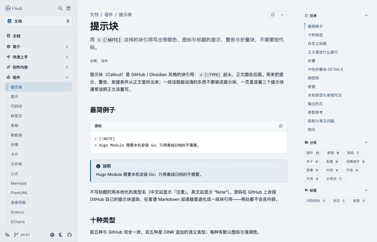
This image sits in the same directory as the page (a page bundle), so the theme
reads its intrinsic size and writes width/height, and the page does not
shift while loading; every image is lazy-loaded. Alternative text serves screen
readers and search engines and should always be written; an empty alt marks a
decorative image, which zoom skips.
Sources resolve in the following order, written the same way in each case:
| Placement | How it is written | Suited to |
|---|---|---|
Beside the page (a bundle: index.md plus the image) |
 |
A screenshot only this page uses; it travels with the page and is shared by translations |
Global resource assets/images/… |
 |
Images several pages share, especially ones needing processing (resize / crop) |
Static directory static/images/… |
 |
Large images and downloads that need no processing; supply width/height where the theme cannot measure them |
| Remote URL |  |
Rare: nothing is downloaded at build time and nothing can be processed |
A relative path is looked up first as a page resource and then as a global resource; failing both, it is emitted as a static path. The theme does not check whether a static path or a remote URL exists. When processing cannot resolve a processable resource, ordinary preview warns and leaves the image unprocessed; strict publishing rejects the warning.
An image inside a line of text is an inline image, rendered as one <img> and
unable to carry attributes; an image standing alone as its own paragraph is a
block image and can carry an attribute line.
This little one  sits inside a sentence — an inline image.
An inline image displays at its own size (50×32 here). An SVG with no intrinsic
size stretches to the container width when inlined, so an SVG belongs as a block
image with explicit width/height.
Block images depend on the site setting
markup.goldmark.parser.wrapStandAloneImageWithinParagraph: false (this site
has it; see Configuration). Without it, Goldmark
wraps a standalone image in <p> and the attribute line is treated as prose.
An attribute line with caption="…" renders the image as a <figure> plus a
<figcaption>. A caption is plain text and is not parsed as Markdown.

A Markdown "title" keeps its own meaning (a hover tooltip) and never becomes
the caption.
width/height are positive integers overriding the resource’s own dimensions:
they give a static or remote image a placeholder box so the page does not shift,
or display a large image smaller (the browser scales it; the file is unchanged).

Page resources and global resources can be processed by Hugo at build time:
command and options must both be given, the command is one of Fit,
Resize, Fill or Crop, and the options are Hugo’s image processing string.
The rendered src is the derivative; with zoom enabled the dialog opens the
original.
Static paths, remote URLs and SVG cannot be processed. Writing command for
one warns and leaves it unprocessed; strict publishing rejects the warning. The
options syntax (anchors, quality, format conversion, as
in 300x150 webp q80) is in
Hugo image processing.
Two forms, for different purposes:
[](href).link="…" to the attribute line (which requires caption or num).
A linked image never zooms. Writing link= with no caption warns and drops the
link, pointing at [](…) instead; strict publishing rejects the warning.
Numbered figures are for books and long manuals: add num to the attribute
line, with an optional #id. The number is a string the author writes (2-1,
3.4) and the theme never counts automatically; the caption gains a localized
“Figure 2-1” prefix, and #id defaults to fig-<num>. Reference it from the
prose with an ordinary link [Figure 2-1](#fig-2-1) or the xref shortcode; a
whole-book list of figures is in Books.
See Figure 2-1.
A numbered figure can be a processed image at the same time (num plus
command), and can carry a link.
Image zoom is off by default. Once the site enables it, block images, figures
and gallery images that have alt text become clickable buttons that open the
full image in a native <dialog> (Esc closes it, focus returns where it was).
This page turns it on in its front matter, so every image above is clickable.
Since OINK 1.1, the preview action is kept in the button’s
accessible name, alongside the image description. It adds no helper text to
copied articles; the copied HTML retains images and authored captions for
rich-text editors. In v1.0.0, a hidden preview label can appear after pasting.
Until upgrading, setting image_zoom: false and rebuilding avoids that label.
Images that never zoom: inline images, decorative images with an empty alt,
linked images, and images marked data-no-zoom. The runtime loads only when the
page really has a candidate; print, Markdown and RSS have no dialog.
The theme has no parameter for swapping an image by colour scheme. Where two
images are needed, give each a class and show one per scheme with
[data-bs-theme="dark"] in the site’s CSS:
class is passed through by the theme untouched, for the site’s CSS to use.
| Output | What appears |
|---|---|
| HTML | Inline <img>; block <img class="td-image">; with a caption or number, <figure class="td-figure"> plus <figcaption>; a zoom candidate carries data-td-image-zoom |
| As HTML, with the zoom controls removed | |
| Markdown |  and the attribute line as they stand |
| RSS | The image src becomes absolute; no zoom |
The attribute line {…} (the line immediately after a block image):
caption
,
,
#id
,
,
[A-Za-z][A-Za-z0-9_.:-]*; the anchor and the Book target IDnum
,
,
[0-9A-Za-z.-]+; registers a Book figure target and prefixes the caption with “Figure N.”width / height
,
,
command
,
,
Fit, Resize, Fill, Crop; must accompany options; page and global resources onlyoptions
,
,
600x300, 300x150 Left, 800x webp q80link
,
,
caption or num; a linked image does not zoomclass
,
,
data-* / aria-*
,
,
style, on*, alt, title, src, and unsupported keys on the attribute
line warn and are ignored; strict publishing rejects the warning. Alt, title,
and src belong to the Markdown image itself.
title is not a caption: the c in  is a hover tooltip.static/ that needs processing moves to the page bundle or assets/.xref cross-referencesA code block is an ordinary Markdown fence. Highlighting is done at build time
by Chroma, which Hugo embeds; there is no highlighter in the browser. Use it for
commands, configuration snippets and source. The {…} attributes on the fence’s
info line decide the title bar, copy behaviour, line numbers and line anchors.
Diagram-style fences (mermaid, echarts, filetree and friends) never take
this path — each has its own render hook.
A fence with no attributes still gets the full shell and a copy button. Without
a title there is no empty bar: the copy button floats at the top right and
appears on hover or when focus enters the block, and is always visible on touch
devices. The shell does not display the language; the lexer name goes into
data-language for stylesheets and tests.
The language tag is simply Chroma’s lexer name. A diff fence renders a patch
with Chroma’s added / removed line styling, no extra component involved:
title gives the block a visible title bar, usually a filename or a path. It
also becomes the block’s accessible name.
filename is a historical alias of title; writing both warns and uses
filename. Strict publishing rejects the warning.
lineNos takes inline (numbers in the same column as the code) or table
(numbers in their own column, selectable on their own and never copied).
lineNoStart changes the first displayed number. hl_lines marks lines to
emphasize, counted from 1 over the source lines inside the fence, independent of
lineNoStart.
lineNos="table" puts the numbers in a separate column — in both modes the
copy button strips them:
tabWidth decides how many spaces a tab expands to and, like style, is handed
straight to Chroma. This site uses class-based Chroma palettes (one for light,
one for dark), so style only takes effect when Hugo is switched back to inline
style mode.
wrap=true changes display only: the source is unchanged and so is the text you
copy. Without it, long lines scroll horizontally.
wrap=true cannot coexist with table line numbers: the number column and the
code column are two table cells, and wrapping puts them out of step. Writing
both warns and disables wrapping, suggesting lineNos="inline" or dropping the
wrap. Strict publishing rejects the warning.
collapse=N shows the first N lines with a “show all N lines” button at the
bottom. The server emits the complete code; folding is a visual clip applied
after the browser measures where line N ends. Without JavaScript, in a screen
reader, and in print, the code is complete.
When the block is no longer than collapse, no button appears. Wrapping and
folding work together: folding measures the bottom edge of the Nth source line
node, so a wrapped line is never cut in half.
By default the whole source is copied. Terminal sessions — the console and
shell-session lexers — copy the commands only: prompted lines survive, the
prompts themselves and the output lines are dropped. Copying the block below
gives two commands, with no $ and no output.
To copy prompts and output too, write copy="all". Using copy="command" on an
ordinary lexer such as bash or sh warns and uses copy="all", because those
cannot tell prompt, command and output apart. Strict publishing rejects the
warning. For multi-line commands, write the
continuation prompt (usually >) on the continuation lines, or they are treated
as output and excluded.
When a session-lexer block contains no prompt at all, the copy button reports failure: the icon turns to its error state, an error is logged to the console, and the clipboard is untouched. It never falls back to copying everything.
copy=false removes the copy button from one block — useful for a
counter-example nobody should paste:
To turn copying off site-wide use params.ui.code_copy: false, which overrides
whatever a block writes in copy (see
Configuration). The copy button
is icon-only; success and failure swap the icon and announce a localized status.
What is copied keeps indentation, blank lines and Unicode, drops line numbers,
and ends with exactly one newline.
Turning “see line 3” into a link takes two steps: give the fence an explicit
id, then enable anchorLineNos=true. The line numbers become anchor links of
the form #<id>-<line>.
Jump to line 4.
Without an id the theme still generates one that is unique on the page, but it
depends on where the fence sits in the page — insert another fence above it and
the ID changes. Only an author-written id is a permanent link. IDs must not
contain whitespace or control characters, and must not collide with any other
viewport, tab, panel, title or line-anchor ID on the page. Invalid or duplicate
IDs warn, and strict publishing rejects the warning.
In a book or a long manual, number the snippets: num plus caption turns the
fence into a Book “example” target that xref can reference and that appears in
the book-wide list of examples. The number is written by the author — the theme
never counts — and id defaults to eg-<num>.
See Example 4-1.
num and caption must appear together. A lone caption is ignored and a lone
number is dropped with a warning; strict publishing rejects the warning.
num is mutually exclusive with the tab attribute tab. For numbering and
indexing figures, tables and equations, see
publishing books.
Consecutive fences carrying tab are assembled into one tab set in the browser.
A group on the first fence makes the set shareable, synchronized and
remembered.
The complete rules — group syntax, URL hash, cross-group synchronization, tabs in running text — are on the Tabs page.
{{< tabs >}} written inside a code block still executes. To display it
verbatim, add a comment marker inside each delimiter —
{{</* tabs */>}}, and
{{%/* steps */%}} for the percent
form. Every shortcode shown on this page is written that way.1.), or the fence leaves the list.| Output | Shape |
|---|---|
| HTML | A <div class="td-code"> shell around Chroma’s .highlight/.chroma; copy and fold buttons ship hidden and appear once the script confirms it can run |
| Complete code; copy, fold and the fade are removed; long blocks may break across pages; the title bar stays | |
| Markdown | The source fence, {…} attributes and all, emitted as written |
| RSS | A static code block with no buttons |
A page with no copy or fold control never loads code-block.js; print, Markdown
and RSS never load it.
Inside the {…} after the language on the opening line, OINK’s own attributes:
title
,
,
filename
,
,
title; both together warn and use filenamecopy
,
,
true is all; command is allowed only on console/shell-sessionwrap
,
,
collapse
,
,
label
,
,
aria-labelid
,
,
tab
,
,
numgroup
,
,
tabvalue
,
,
tabnum
,
,
eg); must appear with captioncaption
,
,
numclass
,
,
.td-code root elementdata-* / aria-* / role
,
,
title, filename and label already give the block an accessible name and
role="group". Any of them together with aria-label, aria-labelledby or
role warns and ignores the conflicting attribute; strict publishing rejects
the warning. Those three attributes pass through only when the block has
neither a title nor a label.
The same line also takes Chroma options, which the theme hands to Hugo unchanged:
lineNos
,
,
table is mutually exclusive with wrap=truelineNoStart
,
,
hl_lines countshl_lines
,
,
"2 4-5", counted over the source lines in the fenceanchorLineNos
,
,
idtabWidth
,
,
diff
fence — Chroma’s .gi/.gd are the added / removed line styles.copy="command" recognizes session lexers only: on any other language it
warns and falls back to copying everything; strict publishing rejects the
warning.id when you intend to share
one.mermaid, math, chem, markmap, plantuml, echarts, infographic,
checksums, filetree and gallery are not code blocks: each has its own
render hook, no shell around it and no copy button.{tab=} attribute on adjacent fences or tables makes a tab set; add a group and it becomes linkable, synchronized and remembered.Tabs put equivalent alternatives side by side: package managers, distributions, YAML / TOML / JSON, an environment variable versus a configuration key. Ordered steps and unrelated content do not belong in tabs — the reader sees only one panel at a time.
The native form is a tab attribute on adjacent blocks. Reach for the
tabs/tab shortcode only when the panels hold running text: several
paragraphs, lists, callouts. Both forms share one runtime, one DOM and the same
keyboard behaviour.
Write two fences carrying tab back to back, separated by a blank line only.
The server emits two titled code blocks with no panel hidden; after the page loads, the runtime regroups adjacent blocks of the same kind into a tab set. On GitHub, in print, and with JavaScript off, the reader sees two complete blocks one after the other.
Write group on the first block only and the set gains a public URL hash
#<group>-<value>, in-page synchronization and browser persistence. Every block
in a group must carry value.
value is the machine value (^[a-z0-9][a-z0-9_-]*$), tab is the human
label; the two are independent. The pnpm panel above answers to
#pkgmgr-pnpm, and visiting this page with that hash selects it.
The set below reuses group="pkgmgr". Switch the package manager above and this
one follows; switch it here and the one above follows. The choice is written to
localStorage under the key td-tabs:v1:pkgmgr and still applies to
same-group tabs on other pages.
This set has no yarn panel. When a value is missing, that set simply stays
where it is; a set is never left with nothing selected. The initial selection is
decided in this order: URL hash, stored value, the shortcode’s default or the
first block, the first tab. Opening the page with a hash switches the set
without overwriting a preference the reader already stored.
The same attributes on a table’s attribute line group adjacent tables into a tab set.
| Parameter | Default |
|---|---|
shared_buffers |
25% RAM |
max_connections |
100 |
| Parameter | Default |
|---|---|
shared_buffers |
128MB |
max_connections |
100 |
Fences and tables are two block kinds and never merge into one set even when adjacent: a tab set is all fences or all tables. To mix them, use the shortcode form below.
A fence can carry both tab and title: the label goes in the tab bar, the
filename title bar stays inside the panel.
A block needs a neighbour of the same kind to become a tab set. On its own it keeps its title rather than becoming a tab bar with one tab.
Only blank lines may sit between blocks. Three things break a set: running text
in between (a paragraph, a heading or a list all count); an HTML comment in
between, of which <!-- prettier-ignore-end --> is the common one; a later
block writing its own group, since only the first block of a set may carry it.
When a panel holds paragraphs, lists, callouts, or several blocks, use the
tabs/tab shortcode. The body is full Markdown.
The repository ships .github/workflows/; a push to main builds and publishes.
baseURL has to be the repository’s Pages address.
Connect the repository in the Cloudflare dashboard; the build command is:
default names the initially selected panel; it must equal a child’s value
and it requires group. Without group, value is forbidden and the theme
generates tab1, tab2 and so on — such a set switches locally and touches
neither the URL nor storage. The shortcode form is stricter than the attribute
form: a mistake is reported at build time instead of in the browser.
| Output | Shape |
|---|---|
| HTML | <div class="td-tabs"> with role="tablist" buttons and panels; every panel is visible until the runtime takes over |
| Consecutive titled static sections, no tab bar | |
| Markdown | The fence form keeps the source fence, {tab=} included; the shortcode form emits **Label** plus the body |
| RSS | Same as print — stacked titled sections |
Only a page that uses tabs loads tabs.js; print, Markdown and RSS never do.
Attributes on a fence info line or a table attribute line:
tab
,
,
group
,
,
tabvalue
,
,
tabThe tabs shortcode:
group
,
,
default
,
,
grouplabel
,
,
The tab shortcode:
label
,
, required
value
,
, required
tab1, tab2 … are generatedBehavioural contract: in a group the panel ID is <group>-<value>; when the
same group name appears a second time on one page, later sets get a -2,
-3 suffix and the deep-link target stays the first set. Ungrouped sets get
theme-generated IDs. The storage key is td-tabs:v1:<group>. A click or a key
press updates the hash with replaceState and writes storage; arriving with a
hash only switches. Left and right arrows (RTL-aware) plus Home/End move and
activate, and focus stays on the tab.
value loses synchronization
and remains a set of local tabs; grouping never silently invents an identity.> [!DETAILS] (see
Callouts).group name is shared site-wide: a reader who picks pnpm on page A gets
pnpm in the same group on page B. That is the point — and it means group
names should mean something, not be tabs1.A table is an ordinary GFM pipe table. The theme’s table render hook wraps every
one in a horizontally scrollable region, and the {…} attribute line underneath
decides which kind of table it is: captioned, a compatibility matrix, a field
list, a numbered table, or a tab set. Merged cells, sorting and filtering are
out of scope; when you need them, change how the data is presented.
Without an attribute line it is just a table. Alignment still comes from the
delimiter row, and header cells are th scope="col".
| Component | Port | Purpose |
|---|---|---|
| PostgreSQL | 5432 | Database |
| Pgbouncer | 6432 | Connection pool |
| Patroni | 8008 | High-availability orchestration |
A table with too many columns never widens the page; it scrolls inside its own region. That region is focusable: Tab into it and the arrow keys scroll, and its accessible name is the localized “Scrollable table”.
| Cluster | Role | Version | State | Lag | Connections | Size | Backup |
|---|---|---|---|---|---|---|---|
| pg-meta | primary | 18.1 | running | — | 42 | 12 GB | 2026-08-17 |
| pg-test | replica | 18.1 | streaming | 12 ms | 8 | 12 GB | 2026-08-17 |
{caption="…"} adds a visible <caption>. It is plain text and it does not
number the table.
| Item | Value |
|---|---|
| Theme version | v0.8.1 |
| Hugo floor | 0.160.1 Extended |
| Licence | Apache-2.0 |
{.matrix} is for “row × column = supported or not” tables: the first column
becomes a row header (th scope="row"), the header row and the first column
stay pinned while scrolling, and the remaining cells are centred unless the
delimiter row says otherwise. ✅ and ❌ are characters the author writes; the
theme does not interpret them.
| OS / PG | PG18 | PG17 | PG16 | PG15 | PG14 |
|---|---|---|---|---|---|
| EL 9 | ✅ | ✅ | ✅ | ✅ | ✅ |
| EL 8 | ✅ | ✅ | ✅ | ✅ | ✅ |
| Debian 13 | ✅ | ✅ | ✅ | ❌ | ❌ |
| Ubuntu 24.04 | ✅ | ✅ | ✅ | ✅ | ❌ |
{.full-width} lets a table exceed the reading column and take the full width
the article has. It suits tables with many short columns.
| Language | Code | Sidebar | Search | TOC | Status | |
|---|---|---|---|---|---|---|
| 简体中文 | zh |
✅ | ✅ | ✅ | ✅ | Reviewed |
| English | en |
✅ | ✅ | ✅ | ✅ | Reviewed |
{.fields} turns a table into a definition list: the first column is the name,
the last is the description, and the columns in between are metadata. It is the
shape for configuration keys, command flags and API fields; the full syntax is
on the Fields page.
offline_search
,
,
page_width
,
,
In a book or a long manual, number the tables: num plus an optional #id and
caption. The table is wrapped in a <figure> labelled with a localized
“Table N.” and registered as a Book target, so xref can reference it and it
appears in the book-wide list of tables. The number is written by the author —
the theme never counts — and id defaults to tbl-<num>.
| Isolation level | Dirty read | Non-repeatable read | Phantom read |
|---|---|---|---|
| Read committed | no | yes | yes |
| Repeatable read | no | no | yes |
| Serializable | no | no | no |
See Table 9-1.
Adjacent tables carrying {tab="…"} form a tab set under the same rules as
adjacent fences: group on the first table enables hash, sync and persistence,
and every table after it needs value. The complete rules are on the
Tabs page.
| Directory | Contents |
|---|---|
content/ |
Pages |
data/ |
Landing and release data |
| Directory | Contents |
|---|---|
assets/ |
SCSS and image resources |
static/ |
Files copied verbatim |
| Output | Shape |
|---|---|
| HTML | A focusable <div class="td-table-scroll"> around the <table>; matrix and full-width are modifier classes on that wrapper |
The complete table laid out to the page width; the wrapper stays but is marked td-table-scroll--static and is no longer a focusable viewport |
|
| Markdown | The source table and its attribute line, emitted as written |
| RSS | The complete static table |
Tables load no script.
The attribute line on the row below the table:
.full-width
,
,
.matrix
,
,
.fields
,
,
caption
,
,
.fields it labels the listmeta
,
,
.fields columns: type required default -; requires .fields#id
,
,
[A-Za-z][A-Za-z0-9_.:-]*; lands on the <table>, or on the <figure> for a numbered tablenum
,
,
[0-9A-Za-z.-]+; registers a Book table target and prefixes the caption with “Table N.”tab / group / value
,
,
class
,
,
<table> for site CSSdata-* / aria-*
,
,
style, on*, and other keys warn and are ignored; strict publishing rejects
the warning.
.fields cannot combine with .matrix, .full-width or
num; num and tab are exclusive; group/value require tab; meta
requires .fields.<!-- prettier-ignore-start --> / <!-- prettier-ignore-end -->.fields/field shortcode..matrix centring is CSS: an explicit alignment in the delimiter row wins.{.fields} can do{.fields} documents configuration keys, command flags and API fields — name, type, default and description each in place, readable on a narrow screen, every entry individually linkable.Fields render “a list of named values with metadata and a description” as a responsive definition list: the name gets its own line, type / required / default sit beside it as small chips, the description starts on the next line, and every entry carries its own anchor. Use it for configuration keys, command flags and API fields. When readers need to compare many rows across the same columns, keep a plain table; when the content is a sequence of actions, use steps.
There are two spellings: a plain table plus {.fields} (the default choice),
and the fields/field shortcode, for when a description needs several
paragraphs, a list or a code block. Both render the same entries.
A pipe table with at least two columns and {.fields} on the next line. The
first column is the name, the last is the description, and every column in
between is metadata labelled with its own header text.
offline_search
,
,
offline_search_max_results
,
,
page_width
,
,
narrow normal wideMetadata here shows as “Header: value”. The theme infers nothing from the header
— Type is only a label. The next section turns those into standard chips.
Cells accept inline Markdown (code, emphasis, links) and empty middle cells are
omitted.
meta=
meta says, in order, what each middle column means: type, required,
default, or - to keep the header as a plain label. With it, the table form
renders the same chips as the shortcode form.
baseURL
,
, required
title
,
, required
defaultContentLanguage
,
,
The rules:
meta should name a role for every middle column — exactly the column count
minus two. Too many or too few warns and ignores meta; strict publishing
rejects the warning.required column is “non-empty means true”: “yes”, “是” or “✔” all read the
same, and the rendered chip is the untranslated required. An empty cell
shows nothing.type and default cells with no inline markup of their own are wrapped in
code formatting, matching the shortcode form.type, required,
default, whatever order the columns are in; - columns follow, in column
order.- mixes with semantic roles, which is how you keep one custom label:
HUGO_MODULE_WORKSPACE
,
,
go.work so the theme resolves from a local checkoutHUGO_ENV
,
,
production to enable minification and fingerprintingcaption gives the whole list a visible label, which is also its accessible
name; id names the outer container so it can be linked to or styled.
params.ui.image_zoom
enable
,
,
selector
,
,
Each entry gets an anchor of the form field-<name>, and a self-link icon
appears beside the name on hover. page_width in the first table above is
#field-page_width — a link you can send on its own when
answering a question.
Duplicate names on one page get -2, -3 suffixes, the same rule Goldmark uses
for duplicate headings. Anchors are generated in HTML only: print and RSS
assemble many pages into one document, where in-page anchors would collide.
When the description needs several paragraphs, a list or a code block, a table
cell cannot hold it. Use fields/field:
Common pig flags
--config
,
, required
Path to the configuration file. Relative paths resolve against the working directory.
When PIG_CONFIG is also set, the command-line flag wins.
--log-level
,
,
Log level, from low to high:
debug: print every remote callinfo: the defaulterror: output only on failure--dry-run
,
,
Print what would happen and change nothing:
required=true and default=false are booleans and take no quotes. default
accepts any scalar: default=0 and default="" both display faithfully (the
empty string shows as ""), and omitting default omits the chip. Every
field needs a non-empty body and must be a direct child of fields.
| Situation | Use |
|---|---|
| One-sentence descriptions that fit in a table cell | table + {.fields} |
| Descriptions with paragraphs, lists or code blocks | the fields/field shortcode |
| Readers comparing many rows across the same columns | a plain table, not a field list |
| Content that is a sequence of actions | Steps |
The table form stays a readable table on GitHub, and OINK’s Markdown output keeps it as a table. That is why it is the default.
| Output | Shape |
|---|---|
| HTML | <div class="td-fields"> around a semantic <dl>; entries carry #field-<name> anchors and self-links |
| The complete definition list, without entry anchors | |
| Markdown | The table form keeps the source table; the shortcode form emits a bulleted list of “name — type; required; default: value” plus the indented description |
| RSS | The complete static <dl>, without entry anchors |
No script is loaded.
The table attribute line, on the row below the table:
.fields
,
,
meta
,
,
type required default -; one per middle column; semantic roles cannot repeatcaption
,
,
id
,
,
class
,
,
data-* / aria-*
,
,
The fields shortcode:
label
,
, required
caption doesid
,
, required
<, > or &class / data-* / aria-*
,
, required
The field shortcode:
name
,
, required
type
,
, required
boolean, string[], durationrequired
,
, required
true shows the untranslated required chip; defaults to falsedefault
,
, required
false, 0 and "" all display.fields cannot combine with .matrix, .full-width or num, and meta
cannot appear on a table without .fields.required and default are untranslated API vocabulary and stay in English
in every language. They are contract words, not interface copy.kind, since, deprecated, location, per-field links or nested
structures, and nothing parses TypeScript or an OpenAPI schema at build time.{.steps} becomes a numbered procedure with dots and a connecting rule; switch to the steps shortcode when each step needs a heading in the table of contents.Steps are an ordered list with numbered dots and a rule running through them: a
plain ordered list plus a {.steps} marker line. The dots and the rule are
drawn in CSS and no script is loaded. Use it for procedures that have an order.
Parallel items with no order belong in a plain list or in cards.
There are two spellings: an ordered list plus {.steps} (the default choice),
and the {{% steps %}} shortcode, for when each step needs its own heading
and those headings belong in the table of contents.
Write 1. for every item and let Markdown do the counting. Inserting, deleting
and reordering steps then needs no renumbering, and the content indent is always
three spaces.
{.steps} must touch the last line of the list; leave a blank line and it turns
into a visible line of braces.
A list item takes any block content: paragraphs, fenced code, callouts, tables, nested lists, images. Indent it to the item’s content column — three spaces.
Clone OINK Starter; it is the small project template for the theme.
Start the local server.
The first build fetches the theme through the Go module proxy, which needs Go on the machine.
Replace three things and it is your site.
| Where | Replace with |
|---|---|
title in hugo.yml |
your site name |
baseURL in hugo.yml |
your domain |
content/ |
your content |
Shortcodes in {{< … >}} form — tabs, cards, badges — work inside a list
item too. The {{% … %}} form does not; see Limits.
When one step differs per platform, write the {tab=} fences side by side
inside that list item and they still assemble into a tab set.
Install Hugo Extended.
Install the dependencies:
Run hugo server to preview.
When prose interrupts a procedure, write the first item of the next group with
its real number. Markdown emits start and the numbering continues from there
(up to 40).
baseURL and the deployment workflow.main and wait for GitHub Actions to finish.When the procedure is long and each step deserves a heading that can be linked
to and collected by the table of contents, use {{% steps %}}: its body is
page-level Markdown, every direct child heading is one step, and the body is not
indented. The three headings below appear in this page’s table of contents.
You need Hugo Extended ≥ 0.160.1 and Go.
brew install hugo go
sudo apt install hugo golang-go
Push to main; the workflow the repository ships builds and publishes.
This is the theme’s only {{% … %}} shortcode. The percent form hands its
body to Goldmark as page-level Markdown, which is the only way its headings can
reach the table of contents and the only way container shortcodes such as
tabs, cards and fields can live inside it. The price is that it cannot
nest inside a list item or inside another percent container.
Keep the headings of one procedure at one level, and never nest one steps
inside another.
| Situation | Use |
|---|---|
| A step is a sentence or two plus a command | ordered list + {.steps} |
| Each step needs a heading, a link and a place in the TOC | {{% steps %}} |
A step must contain a tabs, cards or fields container |
{{% steps %}} |
| The procedure itself has to nest inside another list item | ordered list + {.steps} |
| Output | Shape |
|---|---|
| HTML | The native form is <ol class="steps"> with numbers and rule drawn in CSS; the shortcode form is <div class="td-steps"> plus headings |
| Numbers and content unchanged, the rule stays | |
| Markdown | The source as written: an ordered list plus {.steps}, or headings plus bodies |
| RSS | A static list or titled sections |
No script; with JavaScript off nothing changes.
Neither form takes parameters — only conventions:
{.steps}
,
1.
,
4. (first item)<ol start="4"> and continues from 4; supported for 2–40{{% steps %}}
,
##–######) are the steps; the body is not indented{{% … %}} inside a list item: the multi-line output of a percent
shortcode truncates the list. To put a container in a step, switch the whole
procedure to the shortcode form.{{% steps %}} cannot go inside a list item, nor inside another percent
container.{.steps}. Wrap it in <!-- prettier-ignore-start --> /
<!-- prettier-ignore-end --> when a formatter like Prettier is in play.{.steps} applies to ordered lists only: on a - list there are no numbers.{.cards} lays out a grid of navigation cards; switch to the shortcode when you need icons, badges or images.Cards are a set of parallel links: each card is a linked title plus a sentence, and the grid adapts to the container width. They suit section landing pages, “what to read next”, and a handful of parallel entry points. They do not suit running prose (use paragraphs) or a wall of images (use a gallery).
A link list with {.cards} is a card grid. The link is the title; whatever
follows — is the description.
The whole card is the click target, not just the title text. There is no
columns parameter: the column count follows the container width and collapses
to one on a narrow screen.
The description is optional. One link per line, {.cards} at the end.
When a sentence is not enough, switch to a loose list: the link is its own
paragraph, the description another, with a blank line between items. The title
takes its own line and the description sits under it. {.cards} still has to
touch the last paragraph — no blank line in between.
Every page parameter is defined here exactly once: type, default, accepted values, and the page that explains it.
Site parameters grouped by feature, each row linking back to the guide that explains it.
A link list has no icons, badges, images or multi-paragraph descriptions; those
need the cards / card shortcode. icon is exactly one Font Awesome class
pair and badge is plain text.
Use OINK Starter and establish a local preview before customizing.
A release fact record, an asset table and checksums — all generated locally.
Site-wide shortcuts and focus order.
An icon that is not one valid Font Awesome class pair warns and is dropped in ordinary preview; strict publishing rejects the warning.
A card body renders as page-level Markdown: inline code, emphasis, links,
lists. Parameters such as title and badge are plain text and are not parsed
as Markdown.
hugo mod get github.com/pgsty/oink. The recommended way; upgrading is one
version line.
No Go installation needed:
git submodule addthemes/oinkA card without link renders as a bold title and produces no link.
image resolves in the same order as : page resource → global
resource in assets/ → static path /images/… → remote URL. Local resources
carry their intrinsic size so nothing shifts while loading.
image needs one source of alternative text: image_alt="…" for an informative
image or decorative=true for a decorative one. Writing both warns and keeps
the alt text; writing neither warns and renders the image decorative. Strict
publishing rejects either warning.

Sidebar, article, table of contents — each can be turned off on its own.

A decorative cover: decorative=true emits an empty alt and screen readers skip it.
Card images do not take part in image zoom — the whole card is already a link.
A section landing page (_index.md) needs no hand-written card list: the theme
reads each child page’s title, description and icon and generates the
cards. This site turns it on globally in hugo.yml:
One section can override it in its own front matter, or push the choice down a
whole subtree with cascade:
Automatic and hand-written cards share the td-content-card styling; only the
data source differs. Do not hand-write a list of child pages on a section page —
it drifts out of step with the sidebar. Hand-write cards only when the set is
not this section’s children (external links mixed in, cross-section
recommendations). The keys are defined in
Configuration.
| What you want | Which form |
|---|---|
| A grid of links with one-sentence descriptions | {.cards} link list |
| Icons, badges, images | cards / card shortcode |
| Lists, code or several paragraphs in the description | cards / card shortcode |
| A card with no link | cards / card shortcode |
| This section’s child pages | nothing at all — section_index: cards |
A link list is still a link list on GitHub; a shortcode is not. Use the native form whenever it is enough.
| Output | Shape |
|---|---|
| HTML | Native form: <ul class="cards">. Shortcode form: <div class="td-content-cards"> with one <article class="td-content-card"> each. Both are pure CSS grids and load no script |
| The native form stacks; the shortcode form collapses to two columns; in both, a card avoids breaking across pages | |
| Markdown | The native form keeps the link list; the shortcode form emits - [Title](link) (badge) — description |
| RSS | The same markup as HTML — a readable list of links without site CSS |
The native form:
{.cards}
,
,
First link in an item
,
,
Everything else
,
,
— in a tight list, its own paragraph in a loose onecard parameters (cards itself takes none):
title
,
,
link
,
,
http(s):, mailto:; external links get rel="noopener"icon
,
,
fa-solid fa-rocket; a malformed value warns and is droppedbadge
,
,
image
,
,
image_alt
,
,
image, exactly one of this and decorativedecorative
,
,
true marks a decorative image and emits an empty altBody
,
,
There is no cols, columns, accent, desc or color parameter. Unknown
parameters warn and are ignored in ordinary preview; strict publishing rejects
the warning.
{.cards} recognizes unordered lists only: on an ordered list it does
nothing.{.cards} must touch the list: a blank line in between, or indenting it into
a list item, drops the marker silently — the build succeeds and the list stays
a list. Check that line first when the output is not a card grid.card lives only inside cards: alone, or inside another shortcode, it
warns and is skipped; strict publishing rejects the warning.params.ui.section_index_columns.section_index and friendsfiletree fence draws an annotated directory structure — aligned comment column, per-entry icons, collapsible directories, a draggable split.A file tree is a filetree fence whose body is the listing itself: indentation
is depth, a trailing / marks a directory, and everything after # is a
comment. Use it to explain the part of a directory structure that concerns the
reader, one annotation at a time. When the reader has to copy the listing
verbatim, use an ordinary code block.
Bullets (-, *, +) may be omitted; the result is the same. An entry with
children is a directory. Without children, a trailing / tells the theme it is
one.
Everything after the first whitespace-preceded # on a line is a comment,
rendered as an aligned right-hand column. Comments are plain text, so Markdown
inside them shows literally; for a literal hash write \#.
Where the comment column starts is computed at build time from the widest row,
so every # begins at the same column whether or not the source lines up. The
comment column takes at most the right half of the panel and at least three
tenths. The dashed rule between them is a splitter you can drag, or focus with
Tab and move with the arrow keys (Home / End go
to the extremes).
Overlong names and comments are truncated with an ellipsis inside their own
column, and hovering shows the full text through title. The splitter is the
file tree’s only JavaScript, and only a tree with comments loads it.
truncation in both columns
The fence attribute {title="…"} renders a title bar above the tree; without it
there is none.
the oink.pgsty.com repository root
Depth comes from indentation. Two spaces, four spaces, or tabs (counted as four
columns) all work and need not be consistent within one tree, as long as every
level you return to has been opened before. Output from the tree command can
be pasted whole, root line and summary line included — the summary is dropped.
Returning to an indentation level that was never opened warns and skips that line; the message carries the line number inside the fence, and strict publishing rejects it.
A directory with children is open by default; {open=false} starts it closed.
Directories render as native <details>, so they are keyboard-operable without
JavaScript. open is valid on directories only. An entry with no children whose
name does not end in / is treated as a file; {type=dir} overrides that, and
{type=file} the other way.
the content directory
Icons are inferred from the name: directories get a folder icon that follows the
open state; files are matched first by full filename (LICENSE, Makefile,
go.mod, package.json, .gitignore …), then by extension (md yml toml json sh py go js sql css png svg pdf zip …), and otherwise get a generic file icon.
{icon=…} overrides it and takes exactly one Font Awesome class pair.
{tone=…} colours the icon, using the same vocabulary as
badges: neutral info success warning
danger.
deployment layout: permissions and what matters
tone colours the icon only, never the text. Colour is a supplement; the
meaning belongs in the name or the comment.
Write an entry name as [name](link) to make it a link. Site paths, relative
paths and http(s): all work, under the same URL validation as every other
component.
this site's component pages
A fence carrying tab= (and group= / value=) becomes one panel of a
tab set and can sit alongside code fences.
| Output | Shape |
|---|---|
| HTML | <div class="td-filetree">, an optional title bar, directories as native <details>; a tree with comments also gets the draggable splitter, its only runtime |
| The same tree, fully expanded, no splitter, comments wrapped instead of truncated | |
| Markdown | The filetree fence, emitted as written |
| RSS | The fence source inside a <pre> |
Below the sm breakpoint the layout collapses to a single column: comments move
under the name, stop being truncated, and the splitter is hidden. A tree without
comments is single-column and loads no script at all.
Fence attributes, after ```filetree:
title
,
,
tab
,
,
group / value
,
,
tabclass
,
,
Entry attributes, in the {…} at the end of a line:
icon
,
,
fa-solid fa-lock; a malformed value warns and uses the default icontone
,
,
neutral info success warning danger; colours the icon onlyopen
,
,
false starts it closedtype
,
,
dir or file, overriding the inferenceThe line syntax itself:
Indentation
│ ├── └── drawing from tree- name
-, * and + are equivalentname/
[name](url)
# comment
#; \# is a literal hashN directories, M files
tree summary line, dropped automaticallyUnknown attributes and values, open on a file, malformed {…}, and a dedent
to an unopened level all warn and take a safe fallback or skip the bad line.
The message names the line; strict publishing rejects the warning.
filetree fence is the only form: there is no {.filetree} list marker
and no shortcode.**bold** shows literally, so the fence
source reads correctly anywhere.tone uses the same vocabularyMathematics is rendered by KaTeX at build time into HTML + MathML. A page with
formulas gains one local KaTeX stylesheet and nothing else — no JavaScript, no
request to a remote maths service. Inline formulas are \(…\), display
formulas are $$…$$ or \[…\], and there are math and chem fences. For
TikZ drawings or macro packages KaTeX does not support, use a pre-rendered
image.
An inline formula sits inside a sentence, with the surrounding spaces and punctuation outside the delimiters.
The shared buffer hit ratio is , where is blks_hit and is blks_read.
A formula in its own paragraph goes between $$, centred and set larger.
\[…\] is equivalent.
A B-tree with fan-out over keys has height:
A formula too long for one line scrolls horizontally inside the reading column rather than widening the layout; in print it stays static.
math fence
The math fence is another way to write a display formula, and it does not
depend on the site’s passthrough configuration. On GitHub the source is an
ordinary code block.
That is Little’s law applied to a connection pool: in steady state, the concurrency you need is the arrival rate times the mean response time. A pool is usually far smaller than the number of clients.
The chem fence uses KaTeX’s mhchem extension, and its body is written
\ce{…}. The same extension typesets physical units.
For the syntax see the mhchem manual.
An attribute line under a display formula makes it a numbered equation. num is
a string the author writes (3-1, 5.3) — the theme never counts — and #id
defaults to eq-<num>. The number shows to the right of the formula with a
localized “Equation” prefix.
See Equation 3-1: multiply by the retention period for the floor on archive disk size.
caption (plain text) is optional. #id and caption must appear with num —
there is no half-numbered equation. Incomplete or duplicate targets warn and
drop the unusable part or keep the first; strict publishing rejects the warning.
The prose can reference a numbered equation with an ordinary link, as the
previous section does. For a cross-page reference, or when the “Equation N”
label should be filled in automatically, use xref:
Capacity planning starts from Equation 3-1.
xref may appear before its target; forward references are legal. For a
book-wide list of equations and the book-equations index, see
publishing books.
eq shortcode
eq exists for sites that cannot enable passthrough; its body goes to the same
KaTeX renderer. Without parameters it is a display formula that registers no
number; with num it is equivalent to the attribute-line form above.
This site has passthrough on, so day-to-day writing uses $$. eq is for
migrated manuscripts and for sites that cannot change hugo.yml.
The math and chem fences need no configuration. The $$, \[…\] and
\(…\) delimiters depend on Goldmark’s passthrough extension. Hugo does not
merge a theme’s markup configuration, so this block has to live in the site’s
own configuration file. This site uses:
Every key is defined in
Configuration. Delimiters must
not collide with the prose: a single $ is deliberately not configured, so a
price like “$5” is never read as mathematics.
| Output | Shape |
|---|---|
| HTML | KaTeX HTML + MathML rendered at build time; this page also loads a local katex.min.css, which pages without formulas never load |
| Same as HTML, static, long formulas do not scroll | |
| Markdown | The source as written: $$ blocks with their attribute line, math / chem fences, \(…\); the eq shortcode emits **Equation 3-2.** caption plus a $$ block |
| RSS | The same static text as Markdown |
No form loads JavaScript.
Four spellings:
\(…\)
,
$$…$$ / \[…\]
,
```math
,
```chem
,
\ce{…} in the bodyThe attribute line {…} under a display formula:
num
,
,
[0-9A-Za-z.-]+; registers a numbered equation and shows “Equation N” at the right#id
,
,
[A-Za-z][A-Za-z0-9_.:-]*; the anchor and cross-reference targetcaption
,
,
numThe eq shortcode:
num
,
,
id
,
,
numcaption
,
,
numclass
,
,
num; passed through for site CSSBody
,
,
Broken TeX warns and leaves the expression as written in ordinary preview. The message carries KaTeX’s detail and the source position; strict publishing rejects the warning.
$$, \[…\] and \(…\) render
depends solely on the passthrough extension in the site’s markup.goldmark.
The theme does not read a math: true front matter key, and without the
configuration $$ shows literally. The math fence and eq route around it.$$ blocks and eq can be numbered: the math fence takes no attribute
line, so switch spelling when you need a number.num.caption is plain text: Markdown inside it is not parsed.{#id num=} numberingmarkup.goldmark keysmermaid fence turns text into flowcharts, sequence diagrams, Gantt charts, class diagrams and state diagrams — rendered locally, theme-aware, diff-friendly.A mermaid fence renders text as a flowchart, sequence diagram, Gantt chart,
class diagram, ER diagram or state diagram. The diagram exists as source: it goes
into Git, it reviews as a diff, and search finds it. Rendering happens in the
reader’s browser with the Mermaid copy the theme ships — no external service is
contacted. Diagrams that need pixel-level control belong in an SVG, used as an
image.
flowchart LR
  content["content/"] --> Hugo
  config["hugo.yml"] --> Hugo
  theme["OINK theme"] --> Hugo
  Hugo --> site["public/"]
The fence language is mermaid and there is no other switch. Only when the
theme sees such a fence does it add the Mermaid runtime to that page, and ten
diagrams on one page still load it once.
sequenceDiagram describes messages between participants over time, which suits
request paths and load order.
sequenceDiagram
  autonumber
  participant Reader as Reader's browser
  participant CDN as Static hosting
  participant JS as Page script bundle
  Reader->>CDN: GET /docs/components/mermaid/
  CDN-->>Reader: HTML (a figure plus the fence source)
  Reader->>CDN: GET this page's bundle
  CDN-->>Reader: mermaid.min.js
  JS->>JS: render the fence source into SVG
Note over JS: runtimes the page never used are not downloadedgantt draws intervals. Below is the five-year community support window of each
PostgreSQL major version, counted from its release date; 1825d is five years.
gantt
  title Five-year community support per PostgreSQL major version
  dateFormat YYYY-MM-DD
  axisFormat %Y
  section PG 15
  released 2022-10-13 :2022-10-13, 1825d
  section PG 16
  released 2023-09-14 :2023-09-14, 1825d
  section PG 17
  released 2024-09-26 :2024-09-26, 1825d
  section PG 18
released 2025-09-25 :active, 2025-09-25, 1825dclassDiagram draws types and relationships, erDiagram entities and
cardinality. Both are common ways to explain a data model.
classDiagram
  class Page {
    +string Title
    +string Description
    +int Weight
    +Content()
    +OutputFormats()
  }
  class Resource {
    +string Name
    +string RelPermalink
    +Resize(spec)
  }
  class OutputFormat {
    +string Name
    +string MediaType
  }
  Page "1" --> "0..*" Resource : page bundle resources
Page "1" --> "1..*" OutputFormat : html / print / markdown / rsserDiagram
pg_database ||--o{ pg_namespace : "contains schemas"
pg_namespace ||--o{ pg_class : "contains relations"
pg_class ||--o{ pg_attribute : "has columns"
pg_class ||--o{ pg_index : "is indexed by"
pg_class {
oid oid PK
name relname
char relkind
}
pg_attribute {
oid attrelid FK
name attname
smallint attnum
}stateDiagram-v2 draws states and the conditions between them. Below are the
five states an OINK release passes through. They are not interchangeable, and a
green local build is none of them.
stateDiagram-v2
  [*] --> SourceComplete
  SourceComplete --> Validated : theme checks + site suite green
  Validated --> Published : an immutable signed vX.Y.Z tag is pushed
  Published --> Documented : the site's go.mod pins that tag
  Documented --> Deployed : the production build goes live
  Deployed --> [*]
Published --> SourceComplete : a problem means a new patch version; tags never moveThe top of a fence body may carry Mermaid’s own YAML header — this is not Hugo
front matter. title gives the diagram a title and config overrides Mermaid
configuration for this diagram alone. A diagram that hard-codes config.theme
no longer follows the site’s colour scheme.
---
title: Only the runtimes a page used are bundled
config:
  flowchart:
    curve: linear
---
flowchart TD
  Page --> Which{which components?}
  Which -->|Mermaid fence| M[mermaid.min.js]
  Which -->|ECharts fence| E[echarts.min.js]
Which -->|none| B[base bundle only]The theme reads the current colour scheme when the page initializes: in dark
mode it uses Mermaid’s dark theme, in light mode the theme the site
configured. Switching the colour scheme redraws the diagrams in place — the
page is not reloaded, and each diagram holds its height while it is redrawn,
so nothing on the page moves under you.
Site-wide defaults go in hugo.yml with lowercase keys; the theme matches them
back to Mermaid’s own casing:
The full key table is in Configuration; for accepted values see the Mermaid configuration reference.
A mermaid fence has no tab attribute — adjacent-fence tabs apply to ordinary
code fences only. To compare two diagrams side by side, use the tabs
shortcode.
flowchart LR
Markdown --> Goldmark --> RenderHooks --> HTMLflowchart LR
Page --> HTML
Page --> Print
Page --> Markdown
Page --> RSSEach step inside {{% steps %}} is page-level Markdown and can hold a
mermaid fence; see Steps.
| Output | Shape |
|---|---|
| HTML | A figure holding an empty stage and the fence source as JSON; the page’s Mermaid runtime draws the SVG into it |
The source inside <pre class="td-mermaid-source">, static — no runtime runs there |
|
| Markdown | The mermaid fence and its source, kept as written |
| RSS | The source inside <pre class="td-mermaid-source"> — subscribers see text |
Fence attributes: none. A mermaid fence reads no attribute line; writing
{height=…} or {class=…} neither works nor errors. Size follows the diagram
itself and the container width, and the diagram is centred in it.
Site parameters (hugo.yml):
params.mermaid
,
,
initialize(); write keys in lowercase and the theme matches them back to Mermaid’s casingparams.mermaid.theme
,
,
darkPer-diagram configuration goes in the YAML header at the top of the fence body
(title, config). That is Mermaid syntax, not a theme parameter.
A diagram is centred in the column, and Mermaid scales anything wider than the
column down to fit — a wide sequence diagram can land near a third of its own
size on a phone. Hovering a diagram (or reaching it with the keyboard) reveals
a control in its corner that opens the diagram on its own: rendered again at
full size, panned by dragging, zoomed with the wheel, a pinch, or the + and
- keys, and reset with 0. Esc closes it. A diagram that would have to
shrink past half size to fit opens at 1:1 at its starting corner instead of as
a thumbnail, and zooming back out always reaches the whole diagram however
large it is. Nothing is downloaded for this and there is no switch to set: the
viewer ships with the fence.
<img>, so
{#id num=} numbering does not apply. Export to an image when you need a
number and use the image numbering.plantuml fence writes sequence, class, component, activity and use-case diagrams; rendering requires a PlantUML server you configure yourself.A plantuml fence holds PlantUML source. The browser compresses and encodes it,
appends it to the URL of a PlantUML server, and gets an SVG back. It suits
sequence, class, component, activity and use-case diagrams that need the full
expressiveness of UML. Rendering depends on that server: the theme ships no
default endpoint. enable: true without svg_image_url warns and leaves
PlantUML off in ordinary preview; strict publishing rejects the warning. With
no server available, use Mermaid instead.
PlantUML has to reach a server you run, and this site assumes no endpoint on
the reader’s behalf. In the current theme version the plantuml fence also
double-escapes <, >, & and ", so source with arrows or quotes comes
back from the endpoint as a Syntax Error? image (see Limits).
Every snippet below is correct PlantUML in itself.
The encoded diagram source is sent to the endpoint you configure. Never put passwords, internal hostnames or customer names in a PlantUML fence. Internal sites should run their own endpoint, or use a pre-rendered image.
Sequence diagrams are the most common kind: participant declares a
participant, -> is a synchronous message, --> a return.
That draws four lanes and four messages: the reader opens the page, the browser requests the endpoint with the encoded source, the endpoint returns SVG, and the runtime swaps the fence for an image.
class lists members and "1" -- "0..*" gives a relationship its cardinality —
the usual way to explain a data model.
Three boxes with their fields and two annotated connectors: one publication can serve many subscriptions, and every subscription binds one replication slot.
package groups deployment units, [component] is a box, and --> is the
direction of a dependency.
Two dashed boxes with three components each, and five labelled arrows tracing the collection path.
start / stop with if … then … else … endif draws a branching procedure.
This kind contains no arrow characters, so it is the one kind that renders
correctly in the current version.
One vertical flow line, two diamonds each branching yes / no, four end points.
actor is a stick figure, (use case) an ellipse, and rectangle draws the
system boundary — a good fit for a “who is this for” section.
Three figures on the left, one box with seven ellipses on the right, and connectors saying who can do what.
The server knows nothing about the site’s colour scheme, so the SVG comes back
on a fixed white ground. skinparam backgroundColor transparent removes it and
the diagram sits on the page background. With neutral lines and text it reads in
both modes.
PlantUML’s !theme directive (!theme plain, for instance) also works. Themes
come from the server, so a self-hosted endpoint has to have them installed.
The fence itself has no switch; whether it renders depends on the site configuration:
enable: true without svg_image_url warns and stays off with
params.plantuml.enable requires an explicit params.plantuml.svg_image_url.
Strict publishing rejects the warning. The theme never picks a public service.plantuml/plantuml-server
works; point svg_image_url at its /svg/ path and keep the trailing
slash — the encoded source is appended to it.img-src (plus connect-src
when svg: true) must both allow it; use an absolute URL on a subpath
deployment.These keys are defined in Configuration.
| Output | Shape |
|---|---|
| HTML | The source is emitted as <pre><code class="language-plantuml">; once enabled, the runtime replaces it with an <img> (with svg: true, an <svg data-src>) |
| Same as HTML: the print view loads the runtime and requests the endpoint too | |
| Markdown | The plantuml fence and its source, kept as written |
| RSS | The fence source only — subscribers see text |
When the feature is off, or the runtime has not loaded, what stays on the page is a readable source block, never a broken-image icon.
Fence attributes: none. A plantuml fence reads no attribute line and does not
go through OINK’s code-block shell, so title, copy and the line-number
options from Code blocks have no effect here.
Site parameters (hugo.yml):
params.plantuml.enable
,
,
params.plantuml.svg_image_url
,
,
enable: true, otherwise PlantUML warns and stays offparams.plantuml.svg
,
,
false inserts <img src>; true inserts <svg data-src> and loads an external SVG loader, putting the SVG in the DOM where CSS can reach itThe theme reads those three keys and nothing else.
<, >, & and " are double-escaped: the current theme version escapes the
fence content once too often, leaving literal --> and " in the page
and returning a Syntax Error? image from the endpoint. Diagrams with arrows
(sequence, component, use case, state) therefore do not render today; activity
diagrams, which contain none of those characters, do. Until it is fixed, use
Mermaid or a pre-rendered
image.skinparam is the only lever.<img> the runtime inserts does not pass through
the image render hook, so {#id num=} and image zoom do not apply.params.plantuml.*markmap fence turns a Markdown outline into an expandable, zoomable mind map — and the source stays a readable outline.The body of a markmap fence is a plain Markdown outline: headings and lists
give the hierarchy, and the browser draws it as a tree you can expand and
collapse. It suits showing “what this section covers” at one glance. For flows
with direction and conditions, use Mermaid.
# OINK
## Local-first
- every runtime ships with the theme
- no CDN involved
## Markdown-native
- components are fences and attribute lines
- usable without writing a shortcode
## Four output states
- HTML
- print
- Markdown
- RSS
The first-level heading is the root; other headings and list items hang under it by indentation. Click the dot on a node to fold or unfold that branch, scroll to zoom, drag to pan. The toolbar at the bottom right offers zoom, fit-to-window and download-as-SVG.
Deeper levels are set smaller and the canvas lays itself out. Below are the six sections of this theme’s documentation site and their page counts.
# OINK documentation
## Introduction (4 pages)
### What it is
### Feature tour
### Showcase
### Licences
## Get started (4 pages)
### Choose a path
### OINK Starter
### Repository tour
### From scratch
## Authoring (8 pages)
### Organizing content
### Writing pages
### Front matter
### Blog
### Books
### Releases and downloads
### OpenAPI
## Components (22 pages)
### Callouts / tabs / steps / cards
### Images / galleries / tables / fields
### Diagrams: Mermaid / PlantUML / Markmap / ECharts
## Customization (15 pages)
### Branding / navigation / search / languages
### Landing / versions / taxonomies / print
## Operations (7 pages)
### Preview / deploy / upgrade
### Comments / analytics / troubleshootingNodes take inline Markdown: links are clickable, inline code is monospaced, bold and italic behave as usual.
# Everyday commands
## Preview
- `hugo server` — open [localhost:1313](http://localhost:1313/)
- `hugo server -D` — **including drafts**
## Build
- `hugo --printPathWarnings --panicOnWarning`
- `hugo --gc --minify` — for publishing
## Theme
- `hugo mod get -u github.com/pgsty/oink`
- [theme repository](https://github.com/pgsty/oink)
- [site source](https://github.com/pgsty/oink.pgsty.com)The Markmap runtime carries a local KaTeX, so $…$ inside a node renders as a
formula.
# PostgreSQL metrics worth watching
## Cache hit ratio
- $\frac{blks\_hit}{blks\_hit + blks\_read}$
- below 0.99, look at shared_buffers
## Replication lag
- $lsn_{primary} - lsn_{replica}$
## Transaction throughput
- $TPS = \frac{\Delta xact\_commit}{\Delta t}$The top of a fence body may carry Markmap’s own YAML header — not Hugo front
matter. initialExpandLevel expands only the first few levels and leaves the
rest for the reader; colorFreezeLevel says from which level a branch keeps one
colour.
---
markmap:
  initialExpandLevel: 2
  colorFreezeLevel: 2
---

# Check scripts in the theme repository
## Source-level contracts
### check-i18n.py
### check-taxonomy.py
### check-font-tokens.py
## Output-level checks
### check-output.py
### check-goldens.py
### check-code-blocks.py
### check-content-primitives.py
### check-media-primitives.py
## Browser runtimes
### node --test tests/js/**/*.test.jsEvery map is a fixed 300 pixels tall, so three in a row eat a lot of page. Fold
a panoramic one into > [!DETAILS] and let the reader open it. Every line
inside the disclosure starts with >, fences included.
# pgsty/oink
## layouts/
- baseof.html and the per-type shells
- _partials/shell/
- _markup/ render hooks
- _shortcodes/
## assets/
- scss/ tokens and component styles
- js/ browser runtimes
- third_party/ libraries shipped with the theme
## i18n/
- 32 locale files with identical keys
## docs/
- maintainer contracts| Output | Shape |
|---|---|
| HTML | <pre><code class="language-markmap"> first; the runtime replaces it with <div class="markmap"> and draws the SVG |
| Same as HTML: the print view loads the runtime too | |
| Markdown | The markmap fence and its outline, kept as written |
| RSS | The outline source only — a readable outline for subscribers |
The outline is the content: wherever JavaScript does not reach, the full hierarchy is still legible.
Fence attributes: none. A markmap fence reads no attribute line; the height is
fixed by the theme at 300px (.markmap > svg) and the width fills the reading
column.
Site parameters (hugo.yml):
params.markmap
,
,
The key is defined in
Configuration. Per-map
behaviour goes in the markmap: YAML header at the top of the fence body
(initialExpandLevel, colorFreezeLevel, maxWidth …), which is Markmap
syntax; the accepted keys are in the
Markmap documentation.
.markmap > svg rule
decides it and the fence cannot change it. When a map has too many levels, use
initialExpandLevel or split it in two. Inline SVG also means {#id num=}
numbering and image zoom do not apply.params.markmap it is only a code block: sites that do not use the
component load no runtime.<, >, & and " in the outline: the current theme version
double-escapes them and nodes show literal > or ". Write links as
[text](URL) rather than as autolinks in angle brackets.[!DETAILS] can doparams.markmap.drawio.svg that carries an editable copy on the page as an ordinary image; hovering gives the reader a button that opens the Draw.io editor.The Draw.io integration has neither a fence nor a shortcode — it uses plain
Markdown images. Tick “Include a copy of my diagram” when exporting from
Draw.io and the SVG or PNG carries an mxfile copy inside it; the theme’s
runtime spots that copy and adds an edit button to the image. It suits diagrams
readers are meant to take away and change. A diagram that is only there to be
looked at is an ordinary image.
The syntax is the plain image syntax. The filename does not matter;
.drawio.svg is only a convention.
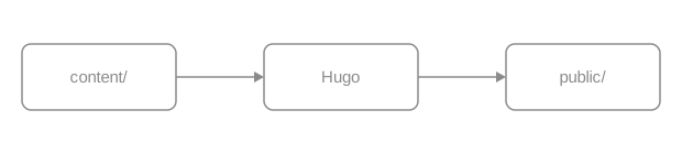
An export that carries an mxfile copy is wrapped in a .drawio container.
Hover it and a pencil button appears at the bottom right; clicking lays a
full-screen iframe over the page and loads the editor the site configured.
The runtime looks at one thing: whether the file’s contents contain mxfile.
The filename is irrelevant. A hand-drawn SVG written exactly the same way — a
block image with the same attribute line — carries no copy, so it gets no
button.

Draw.io images go through the ordinary image render hook, so every
image attribute still applies. Add caption for a
captioned figure; the edit button still appears on the image.
Add {#id num=…} for a cross-referenceable numbered figure, which xref can
reach and which appears in the list of figures like any other.
The complete numbering and cross-reference rules are in publishing books.
Both are recognized. A Draw.io PNG export can carry the same copy in a text chunk, and the runtime’s test is identical.

Prefer SVG in documentation: it scales without loss, its text is real text (searchable, readable by screen readers) and its diffs are legible. Use PNG when the diagram is very complex or the target platform cannot take SVG. Only PNG can go through Hugo’s image processing; operations on SVG warn and leave the source unchanged, and strict builds reject the warning.
Three things, in order.
A full-screen div.drawioframe is inserted holding an iframe whose address is
the configured drawio_server plus a fixed query string
(embed=1&ui=atlas&proto=json&saveAndEdit=1&noSaveBtn=1).
Once the editor is ready, the runtime sends this image’s contents — the mxfile
copy included — into the iframe as a data URL. That step does not go through
your server.
Saving in the editor makes it export in the original format, SVG or PNG, and the
browser downloads it under the same name. The runtime never writes to the
repository: overwrite the file in content/ with what you downloaded and commit
it yourself.
The edit button is there so a reader can take the diagram away and change it. It is not online editing of the site.
enable: true without drawio_server warns and disables editing; strict
builds fail on that warning. The theme does not pick a public service.https://embed.diagrams.net/ works, and the reader’s
diagram then travels to a third-party page.Both keys are defined in Configuration.
| Output | Shape |
|---|---|
| HTML | A plain <img> or <figure>; once enabled, the runtime wraps an image that carries a copy in <div class="drawio"> and adds the button |
| The image prints as usual; the button is hidden except on hover, so it never reaches paper | |
| Markdown | Plain Markdown image syntax |
| RSS | A plain <img> with an absolute URL and no button |
The image itself exists in all four states; the edit button is an increment on top.
There are no fence or shortcode parameters of its own. The image attribute line
is the one from Images: caption, width, height,
link, #id, num, command, options.
Site parameters (hugo.yml):
params.drawio.enable
,
,
params.drawio.drawio_server
,
,
enable: true.svg or .png
candidates. It groups matching images by URL, then reads each URL once to
look for mxfile.none and use neutral greys for lines and text and it reads in
both modes.params.drawio.*echarts fence; Hugo validates them at build time and the browser draws a theme-aware chart with the local ECharts.The body of an echarts fence is an ECharts option object in YAML or JSON — not
code. Use it for quantitative charts that need axes, series and a legend. For
relationships and flows use Mermaid; for order and
hierarchy use Infographic. Hugo parses the
options at build time; invalid input warns and leaves its source readable in an
ordinary preview, while strict publishing rejects the warning. The browser
draws with the ECharts copy the theme ships, and only a page that uses it loads
the runtime.
A bar chart needs three parts: xAxis, yAxis, series. Below is how many
pages each of the six documentation sections has.
tooltip:
  trigger: axis
xAxis:
  type: category
  data: [Introduction, Get started, Authoring, Components, Customization, Operations]
yAxis:
  type: value
  name: pages
series:
  - name: pages
    type: bar
    data: [4, 4, 8, 22, 15, 7]
Both formats are accepted; YAML needs no quotes or commas and is shorter to write. Broken indentation, or a body that parses to an array instead of a map, warns on that line and renders the source instead of a blank chart. Strict publishing rejects the warning.
series is an array, so another entry is another line, and legend lets the
reader hide one. Below are the release years of PostgreSQL major versions and
the end-of-support years implied by the community’s five-year policy.
tooltip:
  trigger: axis
legend:
  data: [Released, End of support]
grid:
  left: 56
  right: 24
  top: 48
  bottom: 40
xAxis:
  type: category
  name: major version
  data: ["9.6", "10", "11", "12", "13", "14", "15", "16", "17", "18"]
yAxis:
  type: value
  min: 2015
  max: 2031
  name: year
series:
  - name: Released
    type: line
    smooth: false
    data: [2016, 2017, 2018, 2019, 2020, 2021, 2022, 2023, 2024, 2025]
  - name: End of support
    type: line
    lineStyle:
      type: dashed
    data: [2021, 2022, 2023, 2024, 2025, 2026, 2027, 2028, 2029, 2030]
Quote the version numbers: unquoted 10 is a number in YAML and so is 9.6,
but as category-axis labels they have to be strings.
Give radius two values for a doughnut. Below is how OINK’s 29 shortcodes break
down by purpose.
tooltip:
  trigger: item
  formatter: "{b}: {c} ({d}%)"
legend:
  bottom: 0
series:
  - type: pie
    radius: [42%, 70%]
    itemStyle:
      borderRadius: 6
      borderWidth: 2
    label:
      formatter: "{b} {c}"
    data:
      - { value: 14, name: Core components }
      - { value: 10, name: Book numbering and indexes }
      - { value: 3, name: Releases and downloads }
- { value: 2, name: OpenAPI }{b}, {c} and {d} are ECharts template placeholders — name, value,
percentage. Writing them in a string is enough; no function is needed.
height defaults to 400px and accepts px rem em vh vw %. full=true drops
the reading-column limit so the chart fills the content area, which suits charts
with many points or long labels.
tooltip:
  trigger: axis
grid:
  left: 40
  right: 16
  top: 24
  bottom: 32
xAxis:
  type: category
  data: [i18n, taxonomy, font tokens, content contracts, navigation, runtime, sidebar icons, search, actions, palette, params, reading, release assets, download, landing, book, migrations, keyboard, shell, output, goldens]
yAxis:
  type: value
  name: scripts
series:
  - type: bar
    data: [1, 1, 1, 1, 1, 1, 1, 1, 1, 1, 1, 1, 1, 1, 1, 1, 1, 1, 1, 1, 1]
An invalid height (360, 36pt) warns and uses the default in ordinary
preview; strict publishing rejects the warning.
Without theme, a chart initializes in the reader’s current colour scheme and
redraws in place when that changes — no page reload. It resizes automatically
when its container does. Switch this page to dark and the ground and text of
every chart above change with it.
A fixed theme pins the colours in both modes:
xAxis:
  type: category
  data: [HTML, Print, Markdown, RSS]
yAxis:
  type: value
series:
  - type: bar
    data: [1, 1, 1, 1]
dark is the only theme built into the runtime; any other ECharts theme has to
be registered with echarts.registerTheme() before it can be named here.
Without a branding requirement, leave theme out and let the chart follow the
site.
$fn:
A fence is data and cannot carry JavaScript. When an option needs a function — a
tooltip formatter, a data-driven colour — write the string "$fn:name" in the
options and register that name on window.OinkEchartsFunctions:
tooltip:
  trigger: axis
  formatter: "$fn:pageShare"
xAxis:
  type: category
  data: [Introduction, Get started, Authoring, Components, Customization, Operations]
yAxis:
  type: value
series:
  - type: bar
    data: [4, 4, 8, 22, 15, 7]
Hover any bar and the tooltip is the sentence that function builds. An
unregistered name resolves to undefined, the chart is drawn as if the option
were not set, and neither the build nor the runtime complains. Keep the script
next to the fence so they change together.
That script is site code and deserves code review. Formatting a string template
({b}, {c}, {d}) can express does not need a function.
A fence body is a literal. Hugo does not expand shortcodes, front matter
variables or files under data/ inside it — the numbers are written in the
fence. The cost is that data cannot be shared; the benefit is that the chart and
its data go into Git together and a diff shows which number moved.
Do not draw data that changes often (version matrices, asset lists). Use a
table or the data/-driven components on a
release page.
| Output | Shape |
|---|---|
| HTML | A canvas container inside <div class="td-echarts"> plus an application/json options block; the local ECharts draws it |
No chart; the fence source inside <pre class="td-echarts-source"> |
|
| Markdown | The echarts fence and its option source, kept as written |
| RSS | Same as print — source only |
Whatever the chart shows, say it in the prose too: print and RSS have no chart.
The fence attribute line (```echarts {…}):
height
,
,
px rem em vh vw %; anything else warns and uses the defaulttheme
,
,
dark is built infull
,
,
true drops the reading-column limit and fills the content areaclass
,
,
style, on*, and unknown attributes warn and are ignored. A fence body that
does not parse to a YAML/JSON map warns and renders as source. Strict publishing
rejects all these warnings. The option keys themselves are ECharts’, documented in the
official option manual.
There is no site-level parameter: ECharts needs no switch in hugo.yml and
loads only where it is used.
$fn: when a function is needed,
and remember an unregistered name resolves to undefined with no error.data/, front matter and shortcodes are all
out of reach; the numbers live in the fence.10, 9.6, on and yes on a category axis become
numbers or booleans and need quotes.infographic fence picks an AntV template and renders a title plus a list of items as a flow, timeline, funnel, grid or hierarchy.An infographic fence picks an AntV template and renders “a title plus a list
of items” as an infographic. Use it for structure: order, hierarchy, comparison.
When you need axes and numeric precision use
ECharts; when you need a flow with conditional
branches use Mermaid. The fence body is data, and
it stays readable text on GitHub.
The first line is infographic <template>, followed by a data block: title
is the title and every entry under items needs at least a label.
infographic list-row-simple-horizontal-arrow
data
  title Three steps in one documentation change
  items
    - label Write
      desc Start with the source language
    - label Check
      desc Zero build warnings, every example really rendered
    - label Ship
      desc Add the translated peer, open the PR
Indentation decides the structure, two spaces per level. Keep labels short and
put the explanation in desc.
The sequence-timeline-* family lays the items out on a time axis, with label
as the point in time and desc as the event.
infographic sequence-timeline-simple
data
  title The last five PostgreSQL major versions
  items
    - label 2021
      desc 14: another round of parallel query and logical replication work
    - label 2022
      desc 15: the MERGE statement
    - label 2023
      desc 16: logical replication from a standby
    - label 2024
      desc 17: incremental backup and JSON_TABLE
    - label 2025
desc 18: the asynchronous IO subsystemsequence-funnel-simple draws stages that narrow. Below are the theme’s five
release states: they are not interchangeable, and only the last one is live.
infographic sequence-funnel-simple
data
  title The five states a theme release passes through
  items
    - label Source complete
      desc The code is written, and that is all
    - label Validated
      desc Theme checks and the site suite are green
    - label Published
      desc An immutable signed tag, resolvable through the Go proxy
    - label Documented
      desc The documentation site pins that tag
    - label Deployed
desc Production runs this versionWhen items have no order between them, list-grid-* arranges them in a grid
rather than a queue.
infographic list-grid-compact-card
data
  title One page, four outputs
  desc Every content component has to produce something usable in all four
  items
    - label HTML
      desc Interactive, runtimes loaded on demand
    - label Print
      desc Disclosures expanded, zoom and copy removed
    - label Markdown
      desc Plain text, compared byte for byte against goldens
    - label RSS
desc Static, from the same source as printAdd value to an item and templates that express proportion — pies, doughnuts,
progress — will use it.
infographic chart-pie-donut-plain-text
data
  title How the 29 shortcodes break down
  items
    - label Core components
      value 14
    - label Book numbering and indexes
      value 10
    - label Releases and downloads
      value 3
    - label OpenAPI
value 2Items can nest through children, and hierarchy-mindmap-* draws two levels of
structure. A top-level theme block changes the whole look; type takes
light, dark or hand-drawn.
infographic hierarchy-mindmap-level-gradient-compact-card
theme
  type hand-drawn
data
  root
    label Theme repository
    children
      - label layouts
        desc templates
        children
          - label _markup
            desc render hooks
          - label _partials
            desc shell and helpers
      - label assets
        desc resources
        children
          - label scss
            desc tokens and component styles
          - label js
            desc browser runtimes
          - label third_party
            desc libraries shipped with the theme
theme belongs to the DSL, not to the fence attributes, and it does not follow
the site’s colour scheme: a diagram with type dark stays dark on a light page.
Check contrast in both modes.
Template names are structure-variant, and one structure has several visual
variants. The common families:
| Structure prefix | What it expresses | Example |
|---|---|---|
list-row-* list-column-* |
Items in a row or a column | list-row-simple-horizontal-arrow |
list-grid-* |
A grid, no order between items | list-grid-compact-card list-grid-badge-card |
list-pyramid-* sequence-funnel-* |
Narrowing stages | sequence-funnel-simple |
sequence-timeline-* sequence-roadmap-vertical-* |
Timelines and roadmaps | sequence-timeline-simple |
sequence-steps-* sequence-snake-steps-* |
Ordered steps | sequence-steps-simple |
compare-binary-horizontal-* compare-quadrant-* |
Binary comparison and quadrants | compare-binary-horizontal-simple-vs |
hierarchy-mindmap-* hierarchy-structure-* |
Hierarchy, with children |
hierarchy-mindmap-level-gradient-compact-card |
chart-pie-* chart-bar-* chart-column-* |
Illustrative charts, with value |
chart-pie-donut-plain-text |
relation-network-* relation-dagre-flow |
Networks and flows, with relations |
relation-dagre-flow |
Choose the smallest form that makes the relationship clear. The full gallery is at AntV Infographic, and the template names match the version shipped with the theme.
| Output | Shape |
|---|---|
| HTML | A canvas container inside <div class="td-infographic"> plus the DSL; the local AntV runtime draws the SVG |
No diagram; the DSL source inside <pre class="td-infographic-source"> |
|
| Markdown | The infographic fence and its DSL, kept as written |
| RSS | Same as print — source only |
Whatever the diagram says, say it in the prose too: print and RSS carry the DSL and nothing else.
The fence attribute line (```infographic {…}):
height
,
,
px rem em vh vw %; anything else warns and uses autofull
,
,
true drops the reading-column limitclass
,
,
style, on*, and unknown attributes warn and are ignored. An empty DSL body
warns and renders nothing. Strict publishing rejects all these warnings.
The DSL’s top-level keys (AntV’s, not the theme’s):
infographic / template
data
title, desc, items (or sequences, compares, nodes, values, relations, root, depending on the structure), ordertheme
type (light / dark / hand-drawn), palette, colorPrimary, stylize …width / height
heightdesign
Each entry under items accepts label, desc, value, icon, children,
group and id. The DSL is defined by the
AntV Infographic documentation; the
version shipped with the theme and its checksum are recorded in the theme’s
VENDOR.json.
theme lives in the DSL, so check contrast in
both modes.gallery fence arranges related screenshots in a responsive grid, each with an optional description or link, reusing the page’s image zoom dialog.A gallery arranges related images in a responsive grid, one image per line inside the fence. It suits several views of one thing: a few screenshots, a few states, a few colour schemes. A single image is an image, and images with no order or comparison between them do not belong in one gallery.
One image per line, written as Markdown’s .

Alternative text is mandatory: it is the item’s title, the only text a screen reader gets, and what decides whether the image can zoom. There is no column parameter — the grid adapts to the container and drops columns on a narrow screen.
Start a description with # after the image and it appears underneath.
Descriptions are plain text, so Markdown inside them shows literally; for a
literal hash write \#.
The default shell: sidebar, article, table of contents
Docsy upstream — the content model is the same lineage
Release pages are generated from facts in data/download, offline
Descriptions need not be the same length: the grid aligns to the tallest item
and a wrapped description does not disturb its neighbours. The image is parsed
first, so a # inside the alt text or the path needs no escaping.
{link=…} at the end of a line turns that item into a link. Site paths,
relative paths and http(s): all work.
Opens the Images component page
Opens "Releases and downloads"
A linked item does not zoom, because clicking already means something else. Both kinds can share one gallery: linked items open a page, the rest open the full image.
Sources resolve exactly as for a plain image: page resource (a file next to the
page in its bundle) → global resource in assets/ → static path /images/… →
remote URL. A local resource carries its intrinsic size, so the page does not
shift while loading; a remote image is neither downloaded at build time nor
measured.

Under assets/images/…, eligible for build-time processing
Under static/images/…, published as is
An unresolved page/global resource is retained as a static path, just like an explicit static path; the theme does not check static or remote existence.
Empty alternative text marks a decorative image: no title, skipped by screen readers, and never a zoom candidate.
Image zoom is a site-level switch and is off by default. This page turns it on in its front matter, so every image above that has alt text and no link opens full size (Esc closes it and focus returns where it was).
Decorative, never zooms
Has alt text, so it opens
A gallery has no zoom runtime of its own; it reuses the one dialog the page shares. With no zoomable image on the page, that runtime is never loaded. The details are in Images · Zoom.
class can go on the whole fence (after the language) or on one item (at the
end of its line). The theme does not interpret it and passes it through for site
CSS. A fence carrying tab= (with group= / value=) becomes one panel of a
tab set.
Sidebar, article, table of contents
The same content-model lineage
| Output | Shape |
|---|---|
| HTML | <ul class="td-gallery"> with one <li> per item; eligible images carry data-td-image-zoom; everything is lazy-loaded |
| The same images stacked, without zoom markers | |
| Markdown | The gallery fence, emitted as written |
| RSS | The same static stack as print |
Galleries load no JavaScript of their own.
The line syntax  [# description] [{key=value …}]:

,
alt is the item’s title; empty means decorativesrc
,
# description
,
\# is a literal hash; must not be empty{link=…}
,
{class=…}
,
Fence attributes:
tab
,
,
group / value
,
,
tabclass
,
,
There is no columns, caption or title attribute. A malformed line or
attribute warns, drops only the invalid part or line, and names the line number
inside the fence. Strict publishing rejects the warning.
{.gallery} list marker and no
shortcode. The cost is that the source does not render as images on GitHub;
the benefit is that four-state output and zoom eligibility are guaranteed by
the theme.A badge is an inline status label that sits right after a name: Beta, deprecated, v0.5, needs a server. It suits a status of one or two words. The author picks a semantic tone and the theme picks the colour, with contrast guaranteed in light and dark. When the status needs an explanation, a procedure or a deadline, use prose or a callout.
text is the only required parameter and must be a non-empty string.
These five values, and no custom colours.
Default Info Supported Experimental Deprecated
Without tone the badge is neutral. Any other value warns and uses neutral
in ordinary preview; the warning names the source location and fails a strict
publishing build.
A badge is an inline element that follows a name; it never takes its own line.
With params.ui.image_zoom off by default enabled,
block images that have alt text open full size. PlantUML needs a server
and Draw.io needs a server warn and remain off when no
endpoint is configured, rather than reaching for a public service.
Never put a shortcode in a heading. Hugo builds the table of contents before it expands shortcodes, so the badge renders correctly on the heading while the table of contents is left with an internal Hugo placeholder. Put the status in the first paragraph under the heading instead:
new in 0.5 The badge sits just under the heading, the table of contents stays clean, and sharing the anchor link does not drag the badge text along.
Badges make a comparison table easier to scan than a column of “yes” and “no”.
| Component | Form | Status |
|---|---|---|
| Callouts | > [!NOTE] |
stable |
| Galleries | ```gallery fence |
stable |
| PlantUML | ```plantuml fence |
needs a server |
The image shortcode |
— | removed |
baseURL in hugo.yamlhugo server to preview port 1313A card has its own badge parameter — plain text, fixed to the right of the
title — and the card body can hold badge shortcodes.
One hugo mod get and you are done needs Go
Builds on a machine with no network manual upgrades
With link the badge becomes an <a>: site paths, relative paths, http(s):
and mailto: all work.
Current version v0.5; for the upgrade steps see Upgrading.
An illegal link warns and is dropped, leaving a plain badge in ordinary preview; strict publishing rejects the warning.
| Output | Shape |
|---|---|
| HTML | <span class="td-badge td-badge--<tone>">, or <a class="td-badge …"> when linked |
| Same as HTML, a static inline element | |
| Markdown | **Beta**, or [**Beta**](/…) when linked |
| RSS | Same as print |
No JavaScript. A badge is not a live region, so adding one does not announce anything to a screen reader.
text
,
,
tone
,
,
neutral info success warning dangerlink
,
,
Named parameters only. There is no icon, class, color, outline or size
parameter. Invalid input warns and takes the safe result: unknown parameters
are ignored, empty text renders nothing, bad tone becomes neutral, and an
unsafe link is dropped. Strict publishing rejects every such warning.
{{< badge text="🔴" >}} tells a screen reader nothing.card has a badge parameter of its owntone uses the same vocabularykbd — one shortcode, a list of key names, a semantic key sequence that stays readable in print and in Markdown output.Keys separate what the reader has to press from the prose. Use it for shortcuts and chords: one positional parameter per key, and the theme draws the caps, adds the separators, and gives screen readers a readable sequence. Command names, flags and text to type are inline code — they are not physical keys.
Press Ctrl with K to open the command palette.
Parameters must be quoted, one key per positional parameter. Missing, empty, or named parameters warn and render no invalid key in ordinary preview; strict publishing rejects the warning.
One parameter is one key, and symbol keys are written as they are.
Escape closes a dialog; / jumps to search; t toggles light and dark; l cycles through languages.
Several parameters render in order with + between them. That plus sign is
hidden from assistive technology, which hears a localized connector instead.
⌘ with Shift with P and Ctrl with Shift with P are the same action. For a literal plus, treat it as a key of its own: Ctrl with + zooms the page in.
Write the label printed on the reader’s keyboard: ⌘ on macOS, Ctrl on
Windows and Linux. Never merge two platforms into one sequence — a spelling like
Ctrl/⌘ cannot be read aloud correctly. Say which platform in the sentence, or
split into tabs.
On macOS press ⌘ with K; on Windows and Linux, Ctrl with K.
A cheatsheet is where keys most often live. Here are some of the global keys this site honours:
| Key | Action |
|---|---|
| Ctrl with K | Open the command palette (⌘ with K on macOS) |
| / | The palette’s full search state |
| t | Toggle light and dark |
| q / e | Previous / next page |
| w s a d | Move, collapse and expand in the sidebar tree |
| Escape | Leave the sidebar tree for the article |
The complete list of site-wide shortcuts is in keyboard navigation.
> for the command-only state, or type a keyword to search<kbd> tags
A raw <kbd> tag in Markdown gets the same styling, and GitHub renders it too.
The difference is that the separators and the accessible sequence are then yours
to maintain: either spelling works for a single key, but use the shortcode for
chords.
Press F5 to reload; in an editor, Ctrl+S saves.
| Output | Shape |
|---|---|
| HTML | <span class="td-kbd-sequence"> around one <kbd> per key; the visible + is hidden from screen readers, which get a localized connector |
| Same as HTML, static | |
| Markdown | Plain text: Ctrl + K, ⌘ + Shift + P |
| RSS | Same as print |
Without CSS or JavaScript the instruction is still readable.
Positional 1..n
,
,
Positional parameters only. There is no separator, label, platform,
class or size: Hugo does not allow positional and named parameters in one
shortcode call.
kbd
calls and a sentence — press Escape, then Enter.Ctrl for ⌘ based on the
visitor’s operating system.Ctrl in {{< kbd Ctrl K >}} is not a
string parameter.hugo server is inline code; Ctrl is a key.Three shortcodes, one job each: include puts another file’s contents into this
page, param prints a page or site parameter, and comment discards a passage.
They are for fragments reused across pages and constants scattered over many:
one set of install steps that appears on three pages is an include, a version
number that appears on dozens is a param, and either way you edit one place.
Content that appears on one page belongs on that page.
include takes one required parameter, file:
The file it pulls in is ordinary Markdown living under assets/:
The result is what you would get by writing it here: the code block has its copy button and the callout is a callout.
Installing OINK into an existing Hugo site takes three commands:
hugo mod get needs Go on the machine; an offline archive or a submodule does not.
The current release is v1.1.0.
The file that gets included is not a page of its own: it is absent from the sidebar, it takes no part in translation pairing, and it has no URL.
file resolves in this order, first match wins:
| Order | Looked up as | Written as |
|---|---|---|
| 1 | A page resource — a file in this page’s bundle | file="config.yaml" |
| 2 | A global resource under assets/ |
file="snippets/dsn.txt" |
| 3 | A file under content/: a leading / is the content root, otherwise relative to the page’s directory |
file="notes/caveat.md", file="/shared/notice.md" |
Missing in all three, or containing .., the include warns and emits nothing.
Strict publishing rejects the warning: include reads from content/ and
assets/ and nowhere else.
A Markdown fragment is read as source, so write the file’s real name on disk.
One trap belongs to step 1 alone: Hugo attaches a language-suffixed page
resource such as notice.zh.md under its stripped name, so asking a bundle for
notice.md hands include already-rendered HTML instead of the source, and
<div class="td-code"> turns up in the Markdown output. Under assets/ and
content/ the name you write is the file you get. Non-Markdown files
(.yaml, .sh, .txt) never have this distinction.
Each language of this page includes its own fragment: English pulls
assets/parts/install-oink.md, Chinese pulls assets/parts/install-oink.zh.md.
Keeping them under assets/ rather than in the page bundle is what lets both
languages fetch the source under the name they write.
code=true renders the file as a code block, and lang= sets the highlighting
language. Point it at a real file in the repository and the documentation cannot
drift from it.
Code blocks and fences share one pipeline: highlighting, line numbers and the
copy button all work. Fence attributes (title=, collapse, hl_lines=)
cannot be passed through; when you need them, write the content as an ordinary
code block.
A fragment is page-level Markdown rendered in the current page’s context:
callouts, tables, lists, images, steps and shortcodes all work. The last line of
the fragment above — “The current release is v0.8.1” — is its
{{< param version >}} expanded on this page.
When two pages include one fragment, each renders it separately and each generates its own heading anchors and code-block IDs. They do not collide.
Install commands, connection strings, support matrices, legal notices: content that changes, and that must change everywhere at once. Content that appears on one page belongs on that page.
param prints one parameter: this page’s front matter first, then the site
configuration — Hugo’s .Param rule.
This site publishes v1.1.0, copyright from 2026,
and this page’s front matter says pigsty_pg_major: 18, which reads back as 18.
Nested keys join with ., so copyright.from_year reads
params.copyright.from_year. A parameter that does not exist, or whose value is
a map or list rather than a scalar, warns and prints nothing; strict publishing
rejects the warning.
param emits escaped plain text, so it can sit in a code fence, a table cell or
a link target. A version number in an install command is the obvious case:
| Item | Value |
|---|---|
| Current version | v1.1.0 |
| Hugo floor | 0.160.1 |
Where site parameters are defined and which exist is in Configuration; page parameters are in front matter.
A comment body appears in none of the four outputs — HTML, print, Markdown,
RSS. An HTML comment is different: it stays in the page source and reaches
llms.txt.
Since PostgreSQL 18, pg_stat_io breaks out WAL statistics.
Verify the dashboards on a test database before upgrading.
There is a comment between those two paragraphs, and viewing the page source will not find it.
| Output | include (Markdown) |
include code=true |
param |
comment |
|---|---|---|---|---|
| HTML | The fragment renders as normal content | Highlighted code block + copy button | Escaped plain text | nothing |
| As HTML | As HTML, without the copy button | As HTML | nothing | |
| Markdown | The fragment’s source, as written | A source fence | The value itself | nothing |
| RSS | As HTML | As HTML | As HTML | nothing |
In Markdown output a fragment is source rather than HTML, and shortcodes inside
it stay as {{< param version >}}. That is consistent with “Markdown output
keeps the source”; it is not a missed render. None of the three shortcodes loads
a script.
include (named parameters only):
file
,
,
.., missing file, or empty value warns and emits nothingcode
,
,
true renders as a code block; quoted code="true" warns and includes ordinary contentlang
,
,
code=true it warns and is ignoredAny other parameter name warns and is ignored, with the file and line in the message; strict publishing rejects the warning.
param (one positional parameter):
parameter name
,
,
.; page front matter first, then site params; missing or non-scalar values warn and print nothingcomment takes no parameters. It is used in pairs, and everything between
{{< comment >}} and {{< /comment >}} is discarded.
include is not a template: you cannot pass variables to a fragment, include
conditionally, or give the included code block fence attributes (title=,
collapse). For per-platform variants, write two fragments and use
tabs.include does no language
fallback and takes the exact path you write. Share one fragment across
languages — this page’s Chinese translation includes the same English file —
or write one per language and point each page at its own.param prints scalars only: structured data — version matrices, download
lists — belongs in data/ and is rendered by the matching component.comment is not “unpublish for now”: the content is discarded on every build.
To take a whole page down temporarily, use draft: true.include to build an index page: a page that pulls in ten
fragments is a page where the reader wanted ten links.include code=true reusesparam can reachasciinema renders a .cast recording as a terminal player on the page. It
suits command-line walkthroughs: the text in the terminal is still text, it can
be selected and copied, and the near-two-minute install excerpt on this page is
about 110 KB. Graphical interfaces belong in screenshots or video — this
component plays terminal recordings only. The player and its styles ship with
the theme, nothing is downloaded at build time, no CDN is contacted at runtime,
and the runtime loads only on a page that uses it, and only in its HTML
output.
file is the only required parameter:
images/install.cast — /images/install.cast
The recording is a single-node Pigsty install on a Debian machine in a 120×36
terminal, trimmed to the first minute and 54 seconds. The file lives at
static/images/install.cast on this site, so the path is written from the site
root. A file under assets/ is written as a relative path: the theme looks in
resources first and falls back to treating the value as a site-root path.
Without title, the window title shows the value of file.
title sets the window title, theme the colours:
Pigsty single-node install — /images/install.cast
theme defaults to auto: it follows the site’s colour scheme, td-light in
light and td-dark in dark, remounting in place when the reader switches. To
pin a terminal palette, the values are the player’s own asciinema, dracula,
gruvbox-dark, monokai, nord, seti, solarized-dark, solarized-light,
tango, plus the theme’s td-light / td-dark. A pinned theme stops following
the colour scheme, and solarized-light on a dark site does not have workable
contrast. The terminal font needs no setting: the player uses the site’s code
font, the one the code blocks use.
Three parameters control where a long recording starts: speed sets the rate,
startAt skips the opening, poster decides the frame shown before playback.
From 60 seconds in, at double speed — /images/install.cast
speed and startAt are numbers (seconds) and poster uses the player’s
npt: notation for a point in time, so npt:1:30 is one minute thirty. The
player above rests on the frame at 90 seconds and starts playing from 60.
idleTimeLimit compresses silent stretches to at most N seconds. This recording
was already compressed while recording (idle_time_limit: 0.5 in the .cast
header), so it does not need it. Only files recorded without an idle limit do.
The player scales to the container width by default (fit="width"), and the
terminal’s rows and columns come from the .cast header. cols / rows
override that:
Only 16 rows tall — /images/install.cast
A size smaller than the recording clips it — the one above shows 16 of the 36
rows. cols / rows exist to correct a wrong size in the recording’s header;
they are not a layout tool. To make the player shorter, record again in a
smaller terminal.
fit takes four values: width (the default, scale to width), height (to
height), both (fit both axes) and none (no scaling — a wide terminal
overflows).
loop replays at the end, and preload fetches the .cast when the page
loads so pressing play does not wait:
Looping: the first minute after login — /images/install.cast
autoplay="true" starts playback as the page opens. It is not recommended: a
“reduce motion” preference only disables the transitions on the player’s
controls, it does not stop autoplay. When you really need it, pair it with
loop, keep the clip very short, and put only one on a page.
Put the recording next to the step: the text says what to do, the recording shows what it looks like.
Install the dependencies and fetch the installer:
Run the install; here are the first two minutes:
pig install — /images/install.cast
Open http://<node address>:3000 and sign in to Grafana with admin / pigsty.
A page can hold several players, and the script and styles load once.
The theme only plays. Record with
asciinema —
asciinema rec --idle-time-limit=2 --cols=100 --rows=28 install.cast — and
check it locally with asciinema play install.cast.
clear before you start..cast is plain text and every character in the
recording is greppable. Check before committing.static/images/ or in the page bundle and commit it. Do not
reference a .cast URL on someone else’s site.| Output | Shape |
|---|---|
| HTML | A <div class="td-asciinema"> window frame plus the player; the player CSS/JS and the runtime load on demand, once per page, and only in this output |
| A labelled static link showing the recording’s address; no player, no runtime | |
| Markdown | A plain Markdown link, [title](/images/install.cast) — no component markup, no configuration block |
| RSS | The same plain link |
A recording must never be the only source of information. Write the key commands
and the key output beside it in text or a code block: offline readers, whatever
consumes llms.txt, and anyone printing the page get the link and your prose,
not the terminal session.
file
,
,
title
,
,
theme
,
,
auto follows the site’s colour scheme; or td-light td-dark asciinema dracula gruvbox-dark monokai nord seti solarized-dark solarized-light tangofit
,
,
width height both none; anything else warns and uses widthcols / rows
,
,
speed
,
,
startAt
,
,
idleTimeLimit
,
,
poster
,
,
npt:mm:ssautoplay
,
,
loop
,
,
preload
,
,
.cast when the page loadspauseOnMarkers
,
,
markers
,
,
The boolean-ish parameters compare against the text true: loop="true" and
loop=true both enable, anything else disables. Everything else warns and
carries on: an illegal fit uses width, a non-numeric speed uses 1, a
non-numeric startAt uses 0, and a cols, rows, idleTimeLimit or marker
time that is not a number is ignored. None of them stops an ordinary build,
and every one of them fails a publishing gate built with --panicOnWarning.
markers labels are lost: the theme flattens the time:label list into a
one-dimensional array, and the player accepts only pairs, so the timeline ends
up with unlabelled markers. A marker whose time is not a number warns and is
skipped. When you need chapters, write a list beside the recording..cast: http and https addresses are accepted,
and the page then depends on someone else’s site. Any other scheme, a
protocol-relative //host, or an empty value warns and the component renders
nothing.